Understanding Design
|
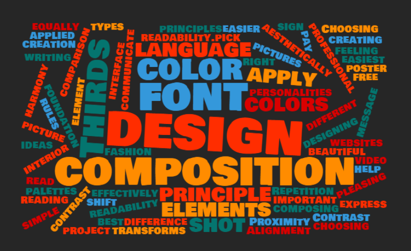
The elements of design can and should be applied to all types of creation. They apply equally whether you are creating a poster, designing a user interface, or composing a shot for a video. Even fashion and interior design apply the same principles. The language of design can be taught just like reading and writing and help you express your ideas just like words.
|
|
|
CARP Design Model
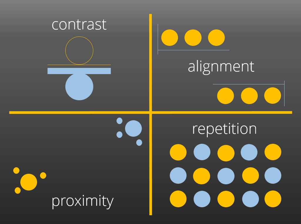
CARP (sometimes known by CRAP) stands for Contrast, Alignment, Repetition, and Proximity. These four elements are the foundation for the language of design. For the best design, each element needs to be in harmony with the other. Basic CARP Explanation Interactive CARP Explanation |
|
ADDIE Design Model
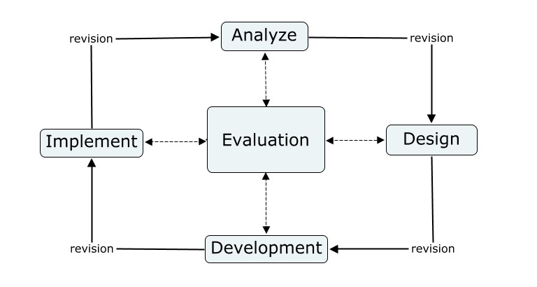
The ADDIE model is the most well-known instructional design model. It stresses the importance of planning and revision in the design process. ADDIE Design History ADDIE and Other Instructional Design Models |
|
Fonts
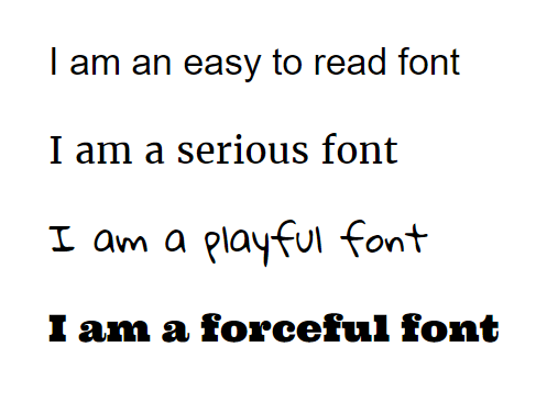
Choosing the right font for your project can make all the difference to how effectively you communicate your message. Fonts all have different personalities, so it is important to match your font to the feeling you are trying to convey. In addition, some fonts are much easier to read than others. While you must pay for some fonts, there are many beautiful ones that are available for free. How to Choose a Font More About Choosing a Font Google Web Fonts - free to use online or download Font Squirrel - huge repository of free fonts Dafont - an even larger font database, although not all fonts are free How To Install Fonts Onto Your Computer |
|
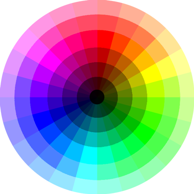
Color Theory
The most important principle to keep in mind when choosing colors is maintaining readability. If you pick colors that do not have enough contrast, than you've lost readability. Fortunately there are many websites that can generate eye-pleasing color palettes for you. Basic Color Theory Color Theory Tutorial Adobe Kuler Paletton.com Colour Lovers Palettes More on the importance of readability |
Composition
One of the easiest rules of composition to remember is the Rule of Thirds. Below is an example of the Rule of Thirds in action. I took these two pictures of the same sign. The left picture does not follow the Rule of Thirds principle, while the one on the right does. Notice how much more professional and aesthetically pleasing it is in comparison to the left one. A simple shift in composition completely transforms the shot.
One of the easiest rules of composition to remember is the Rule of Thirds. Below is an example of the Rule of Thirds in action. I took these two pictures of the same sign. The left picture does not follow the Rule of Thirds principle, while the one on the right does. Notice how much more professional and aesthetically pleasing it is in comparison to the left one. A simple shift in composition completely transforms the shot.

|

|
